
Four-Part Challenge
First choose a location and datasets
- Part 1: Identify insights from data
- Part 2: Design a map
- Part 3: Engage audiences with interactivity
- Part 4: Blog about your process, challenges and successes
Finally, submit your visualization!
The challenge is set up in four parts in order to:
- Encourage documentation and sharing of the steps you take in your process to create your visualization;
- Provide a suggested structure for dataviz beginners; and
- Build momentum and community around the challenge as we collectively work on our visualizations.
You don’t necessarily need to do these parts in order, but you do need to complete each part. Ultimately, you’ll need to submit three URLs to posts that show your dataviz process, a URL to a blog post, and a URL to your finished visualization. Tip: If you are submitting an entry as a team, you only need to have one blog and one social post per part.
You can use any data visualization software or tools that you prefer, provided that you can use a Mapbox basemap as part of your project. A whole host of tools are compatible with Mapbox basemaps, including Mapbox GL JS, Leaflet, Tableau, Power BI, Microstrategy, D3, Carto, and more. See the full challenge rules at: understandrisk.org/vizrisk/rules/
The rest of this page details the four parts of the challenge, with suggested resources for each. You can also check out resources suggested by challenge participants in a living Google Doc here.
First – choose a location and datasets to focus on
#VizRisk partners have prepared three suggested geographies and recommended datasets for your visualizations: understandrisk.org/vizrisk/data/.
You are also welcome to select another geography to focus on if you are interested in other locations or other risk datasets. You may use any risk or hazard datasets (we encourage you to use open data as much as possible).
Part 1 – Data analysis: Identify insights in your data
The first step to any effective data visualization is finding the compelling insights or narratives buried in your data.
Requirement to complete Part 1:
Using #VizRisk, share a social post (Twitter, Instagram, Facebook, or LinkedIn) with a screenshot of some or all of your rough, ‘pre-visualized’ data and a brief teaser explanation of the insight or story that you plan to visualize. Tag @UnderstandRisk @Mapbox and @DataVizSociety for more views. Save the URL link to this post! You’ll need it when you submit your final visualization.
Example:
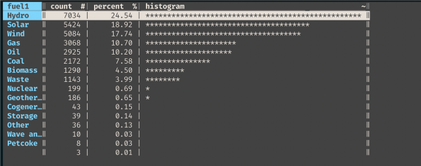
“Checking out my chosen #VizRisk data in Visidata – based on a histogram of fuel types, I’m going to use the first 10 and lump the last 5 together. Anyone else working with this dataset? @UnderstandRisk @Mapbox @DataVizSociety”
Suggested process:
- Learn about the context of your selected location and the disaster risk challenges and questions it faces.
- Download and explore the recommended datasets for your selected location. Identify other datasets that you need in order to visualize and communicate insights about disaster risk. What insights would help governments and citizens prepare for and respond to these hazards? How can these insights help people understand risk?
- Do some data profiling, or ‘previsualization’, to help you identify the insights from the data. Do the data tell a story? Which insights make sense to visualize on a map? Do these insights make sense?
- Think ahead to your finished visualization and prepare your selected datasets appropriately. What type(s) of visualization techniques might be appropriate for these data and insights? What fields will you need in your data? Do you need to do some calculations or joins between datasets?
- Clean and format your datasets into formats that you can work with in Mapbox Studio (or other tools of choice).
- Upload your datasets to Mapbox Studio (or other previsualization tools of choice). Don’t have a Mapbox account? Sign up for free
Resources:
- Share ideas, questions, and resources with peers and mentors in the #challenge-vizrisk channel in the Data Visualization Society Slack
- Webinar 1: Making map-based data visualizations [Watch recording]
- Webinar 2: Understanding and communicating risk data [Watch recording]
- Open build session presentations [Watch recording]
- Resources for understanding risk data:https://understandrisk.org/vizrisk/what-is-risk/
Sample tools:
- Data prep, profiling, and pre-visualization
- Exporting OpenStreetMap data
- Converting data formats for Mapbox Studio
- QGIS / desktop GIS
- csv2geojson
- http://geojson.io
Other tool suggestions? Share them in the #challenge-vizrisk channel in the Data Visualization Society Slack
Part 2 – Map design: Create your basemap style
Requirement to complete Part 2:
Using #VizRisk, share a social post (Twitter, Instagram, Facebook, or LinkedIn) with a screenshot of your chosen (ideally customized) Mapbox Studio basemap style and a short comment about why you chose that style. Tag @UnderstandRisk @Mapbox and @DataVizSociety for more views.
Save the URL link to this post! You’ll need it when you submit your final visualization.
Example
“I’ve decided to use a very dark @Mapbox style for my #VizRisk basemap to keep the emphasis on the bright interactive markers I plan to build. What do you think? @UnderstandRisk @Mapbox @DataVizSociety”
Suggested process:
Visualizing data on a map provides context that helps make data more accessible and relatable. But maps can also introduce new visual complexities, making the design of your basemap an important part of your design process. Mapbox tools allow you to have total control over the visual design of your basemap, without needing to be a geospatial expert.
- To create your basemap (or background map layer) for your visualization, you can either use an existing Mapbox core style or create a customized style using Mapbox Studio.
- In Mapbox Studio, customize the style of your basemap and any additional data layers that you want to add to your basemap. Consider your target audiences and the communication goals of your visualization.
- Think ahead to your interactive map – explore options like zoom-based styling for a dynamic map experience.
Resources:
- Share ideas, questions, and resources with peers and mentors in the #challenge-vizrisk channel in the Data Visualization Society Slack
- Webinar 1: Making map-based data visualizations [Watch recording]
- Open build session presentations [Watch recording]
- General guidance:
- Working in Mapbox Studio:
- Mapbox Studio manual
- What is a style?
- Tutorial to create a custom style
- Other map design tutorials
- Styling with expressions in Studio
- Tip: Kickstart a totally custom basemap using Mapbox Cartogram, a drag-and-drop tool that chooses colors from an image file.
- Inspiration:
Sample tools:
- Color Guide from datawrapper.de
- Color Brewer 2.0
- Tippecanoe (for creating MBTiles, runs in terminal) – and a useful how-to for adjusting zoom extent of a tileset.
Other tool suggestions? Share them in the #challenge-vizrisk channel in the Data Visualization Society Slack
Part 3 – Interaction design: Build your interactivity
Requirement to complete Part 3:
Using #VizRisk, share a social post (Twitter, Instagram, Facebook, or LinkedIn) with a screenshot (or live link!) of your data visualization under construction and a short comment about your visualization technique. Tag @UnderstandRisk @Mapbox and @DataVizSociety for more views.Save the URL link to this post! You’ll need it when you submit your final visualization.
Example
“Working on dynamic zoom-based clusters that show a breakdown of the fuel type data by location, still playing with the colors but I like the interactivity #VizRisk Part 3!@UnderstandRisk @Mapbox @DataVizSociety”
Suggested process:
- The steps for this part depend largely on your chosen dataviz tool(s). If you don’t have a preference, consider the sample tools listed here. Which tools best fit your goals and skills? What interactions help communicate the insights of your data?
- If you are building your interactivity using code with something like Mapbox GL JS (Javascript library) you might follow steps like this:
- Create a simple webpage and initialize a map (As described in this tutorial)
- Load in your data sources
- Add in ways for viewers to interact with the visualization: layers toggles, time series animations, pop-ups, hover effects, fly-to etc. Check out Mapbox GL JS examples for inspiration and code snippets
Resources:
- Share ideas, questions, and resources with peers and mentors in the #challenge-vizrisk channel in the Data Visualization Society Slack
- Webinar 1: Making map-based data visualizations [Watch recording]
- Open build session presentations [Watch recording]
- Guides
- Inspiration
Mapbox GL JS resources
- Initialize a map
- Make a choropleth map
- Add third-party data
- Mapbox GL JS expressions
- Building custom intelligence tools
- Using Mapbox with Microsoft Power BI
- Using Mapbox with Tableau
- Using Mapbox with Microstrategy
- Using Mapbox with Carto
- Using Mapbox with deck.gl
Sample tools:
Other tool suggestions? Share them in the#challenge-vizrisk channel in the Data Visualization Society Slack
Part 4 – Polish and blog: Share your visualization and process
Requirement to complete Part 4:
Put the finishing touches on your visualization (title, description, attribution to data sources, legends, front-end UI elements etc.). Then write a blog post that documents what you learned and built! Your blog post can be shared on Medium or another site, as long as it is publicly accessible.
Your blog can be as short as a few hundred words or be a longer write up of your story and process – whatever works for you or your team. Consider the evaluation criteria that your submission will be scored against when writing your blog.
Your blog must include:
- An overview of the datasets that you used and their sources
- An overview of any Mapbox tools and third-party tools you used
- A link to your live, publicly accessible visualization (or embed it directly)
- At least two screenshots (or a screengrab/gif) of your visualization
- At least two code snippets to help explain how you built it (if applicable)
- A link to your code (if applicable) or more detailed technical documentation, if you are willing to share it (this is strongly encouraged to help use your visualization and grow the dataviz community)
Celebrate! Share your final project using #VizRisk in a social post (Twitter, Instagram, Facebook, or LinkedIn) with a screenshot of your finished map, a link to your blog post, and a link to your live visualization. Tag @UnderstandRisk @Mapbox and @DataVizSociety for more views. Be sure to share it in the #challenge-vizrisk channel in the Data Visualization Society Slack!
Example blog posts:
- Mapping Femicides in Chile
- A map about refugees
- BlackLandscapes matter
- International migrant stock map
- #LasCallesDeLasMujeres (TheStreetsOfWomen) meets Mapbox
Example final social share:
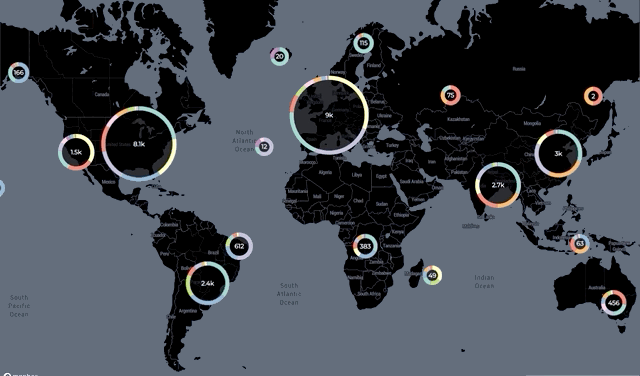
“Here’s my final #VizRisk Challenge visualization @UnderstandRisk – exploring energy sources and fuel types around the world. See how I built these dynamic HTML clusters using @Mapbox GL JS: https://blog.mapbox.com/clustering-properties-with-mapbox-and-html-markers-bb353c8662ba @DataVizSociety”
Final step: Submit your entry!
Use the form bit.ly/VizRiskSubmit to enter your visualization to the challenge. The form closes at 11:59pm EDT on July 15th.
All complete submissions will be considered by a panel of judges, with winners of the categories and grand prize announced August 15th. Details on challenge rules, eligibility, how to enter, prizes, and evaluation process.